Changing the colours of a fractal
The image produced by your fractal generating program will be coloured in a random way from the point of view of human esthetics. The colours may be bold or dull, they may look harmonised or not, they may not be to your taste.
Almost every fractal program allows you to alter the colours of the fractal produced. However, the colour controls tend to give unpredictable results and require you to render the fractal anew. This takes time, which is always a scarce commodity. An alternative method that is much faster and also more intuitive is to do post-processing in a graphical program, such as Photoshop or ACDSee.
You can cycle through the possible colours by gradually altering the hues in the entire image. To do this in Photoshop, use Image -> Adjustments -> Hue/Saturation and move the hue slider through every value, both right and left of the centre. Save the images that appeal to you. Then hit control-I to reverse the colour values and repeat the process.
The idea is twofold: to obtain better colour combinations as well as to highlight different aspects of the fractal's structure. Not only can a dull-looking fractal become striking, but new structure can be revealed. It will give you ideas for what to zoom into - areas that suddenly become interesting after colours or light/dark have been changed. I am often surprised by how changing the colours alters the perceived shape of a fractal.
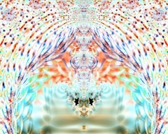
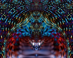
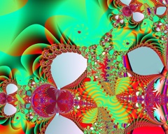
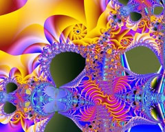
Here is an example of each. In the first pair I simply inverted the colours. In the second I inverted the colours then altered the hues. Note how much more structure is visible in the yellow spiral above the centre of the last image. This is obvious even looking at the thumbnails.


